


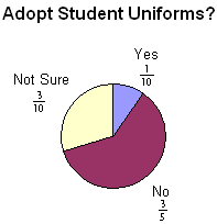
Problem: At a private school, 300 students and faculty voted on adopting uniforms for students. The results are shown in the table below. Display the results of this vote in a circle graph.
| Adopt Student Uniforms? | |
| Response | Number |
| Yes | 30 |
| No | 180 |
| Not Sure | 90 |
Analysis: In order to draw a circle graph, we need to represent the number for each response as a fraction or as a percent.
| Adopt Student Uniforms? | |||
| Response | Number | Fraction | Percent |
| Yes | 30 |  |
10% |
| No | 180 |  |
60% |
| Not Sure | 90 |  |
30% |
Solution: The results of this vote have been displayed in the two circle graphs below. In the graph on the left, fractions are used to label the data. In the graph on the right, percents are used to label the data.
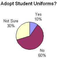
As you can see, a circle graph is easier to read when a percent is used to label the data.
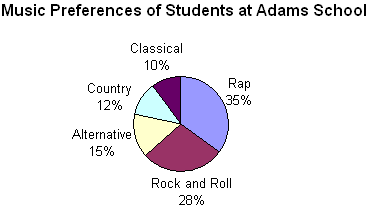
Example 1: A poll was taken to find the music preferences of students at Adams School. Each student voted only once. The results of this poll are displayed in the circle graph below.
A circle graph shows how the parts of something relate to the whole. A circle graph is divided into sectors, where each sector represents a particular category. The entire circle is 1 whole or 100%, and a sector of the circle is a part. Let's define the various regions of a circle graph.
| title | The title tells us what the graph is about. |
| sectors | The sectors of the circle graph show what percentage of the whole is being represented by each category. |
| labels | The labels identify the facts for each category. |
Now that we have identified the parts of a circle graph, we can answer some questions about the graph in Example 1.
Example 1: A poll was taken to find the music preferences of students at Adams School. Each student voted only once. The results of this poll are displayed in the circle graph below.

| QUESTION | ANSWER | ||
| 1. | What is the circle graph about? | Music Preferences of Students at Adams School | |
| 2. | How many sectors are in the graph? | 5 | |
| 3. | Which type of music do students prefer most? | Rap | |
| 4. | Which type of music do students prefer least? | Classical | |
| 5. | What percentage of students prefer Alternative? | 15% | |
| 6. | What percentage of students prefer Rock and Roll? | 28% | |
| 7. | List the categories in the graph from greatest to least. | Rap, Rock and Roll, Alternative, Country and Classical | |
Note: Another name for a circle graph is a pie chart. As you can see in the pie chart below, a slice of pie for country music has been separated from the rest of the chart. (Note: Such a separation is usually done to emphasize the importance of a piece of information.)
Let's look at some more examples of circle graphs.
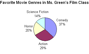
Example 2: Students in Ms. Green's film class voted for their favorite movie genre. Each student voted only once. The results of this vote are displayed in the circle graph below.
| QUESTION | ANSWER | ||
| 1. | What is the circle graph about? | Favorite Movie Genres in Ms. Green's Film Class | |
| 2. | How many sectors are in the graph? | 4 | |
| 3. | Which movie genre do Ms. Green's students prefer most? | Comedy | |
| 4. | Which movie genre do Ms. Green's students prefer least? | Science Fiction | |
| 5. | What percentage of students prefer action movies? | 29% | |
| 6. | What percentage of students prefer horror movies? | 20% | |
| 7. | List the categories in the graph from least to greatest. | Science Fiction, Horror, Action, Comedy. | |
Let's look at a modified version of Example 2.
Example 3: Students in Ms. Green's film class voted for their favorite movie genre. Each student voted only once. The results of this vote are displayed in the circle graph below.
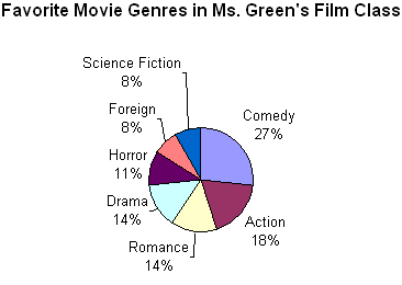
The circle graph in Example 3 has seven sectors which makes it difficult to read. Although lines were used to connect some of the labels to their respective categories, this graph is too complicated because there is simply too much information. In general, if there are more than 5 or 6 categories in a set of data, then a circle graph is not a good choice for displaying that data. You will also notice that some of the sectors in the graph above have the same values. Romance and Drama each represent 14% of the class vote; Foreign and Science Fiction each represent 8% of the class vote. As a result, it is difficult to see the difference in size of the slices in this graph. The data above would be clearer and easier to read if it was displayed in a bar graph.
Summary: A circle graph shows how the parts of something relate to the whole. A circle graph is divided into sectors, where each sector represents a particular category. Circle graphs are popular because they provide a visual presentation of the whole and its parts. However, they are best used for displaying data when there are no more than 5 or 6 sectors and when the values of each section are different.
Exercises
Directions: Refer to the circle graph below to answer each question. For each exercise below, click once in the ANSWER BOX, type in your answer and then click ENTER. Your answer should be given as a word or as a whole number. After you click ENTER, a message will appear in the RESULTS BOX to indicate whether your answer is correct or incorrect. To start over, click CLEAR.
A survey was taken of which pets are bought by customers at a Pet World store. Each customer voted only once. The results of this survey are displayed in the circle graph below.
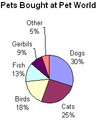
| 1. | How many sectors are in the graph? |
| 2. | Which type of pet is bought most? |
| 3. | Which type of pet is bought least? |
| 4. | What percentage of customers buy gerbils? |
| 5. | What percentage of customers buy birds? |

